
 by Maria Elena Alonso-Sierra
Many people believe that when writers launch a book, it is the end of any future authorial involvement, especially in the case of book covers.
Nothing could be further from the truth.
So, why does an author change a cover?
There are as many reasons as to answers to that question.
First, a bit of history. Book publication has evolved dramatically since the early 2000s. Presently there are many venue choices in which an author can publish a book, such as self-publishing (what we call independent, or indie), small presses, larger presses, and the big 5 editorial houses. If you’ve gone the route of traditional publishing (the latter three), the actual publishing house has creative control of your cover, so the theme of it is chosen for you. In smaller presses, the author can have more creative input, but the graphic design is done in-house and, ultimately, theirs is the last word. As an independent, the author has total creative control and each has the freedom to create book covers themselves, or contract it through a professional graphic designer. Fortunately, for those authors who wish to create their own covers, there are a plethora of software programs that will make that possible. For those, like myself, who have no inkling on how to use that type of software, and doesn’t have the time or the talent to learn, we go through graphic designers.
Now back to the main subject: Why a book cover change.
Many traditional publishers have popular authors with incredible backlists. So, in order to keep authors current with the times, covers will be updated from time-to-time to refresh and reflect the tastes of contemporary readers. Remember the Fabio romance novel covers? They were all the rage back in the 80s and 90s, and every single romance novel cover had Fabio (or similar cover models), plastered on them in the same poses, in different costumes, and in various stages of undress. Let me tell you, I wish I had Fabio’s back account. However, today’s authors wouldn’t be caught dead using that type of graphic, because readers have evolved and are not impressed…they are more sophisticated when it comes to graphic design now. That doesn’t mean the theme of the alpha male overpowering and overwhelming womankind with his strength and love is no longer used. It is. It depends on the genre, with images reflecting the theme of the novel. These can be tasteful, or in your face, or suggestive, even downright erotic.
The choices nowadays are endless.
Another reason covers are changed depends on whether you swap publishing houses. I have many author friends who have changed publishers and, therefore, the covers metamorphose to reflect the mission and scope of the publishing house.
Another reason for a change? Major corrections to the actual novel, whether it is in editing, or deletions of pages or chapters. This offers the opportunity to revamp a cover to suit the current taste of readers.
For independent authors, like myself, we can change covers at any time, as we see fit. Which is a freedom and a curse, sometimes. It carries a ton of responsibility. And it can’t be abused either.
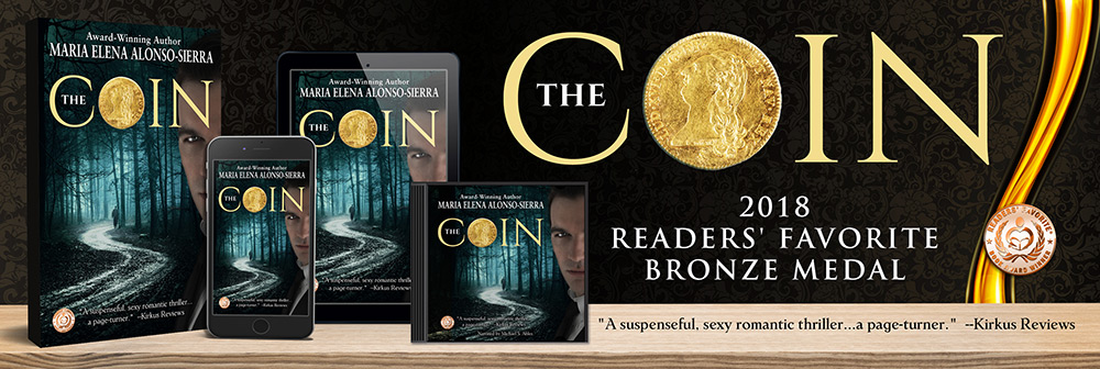
Also, being an independent, one very important thing is to keep your ear to the ground and listen to what your customers are saying. My first cover for my romantic suspense novel, The Coin, was a mess, and I won’t talk about it because I created it myself using the software CreateSpace allowed free access to, and it was, well, frankly, an embarrassment. By the next cover change for The Coin, I contracted a professional graphic designer and he created an absolute gem. I loved it. Loved it. Loved it. It had all the elements of the novel: a wide view of the Promenade des Anglais in Nice, France, where the novel is set, and big bold lettering for the title. It was all I wished for in a cover, with beautiful yellows and golds. I was ecstatic. And that cover stayed with me for years—six years to be exact. Until an editor looked at it, (I was attending one of the many workshops I go to in order to keep current with trends in the industry), and she told me point blank that, if I hadn’t mentioned the novel was a romantic suspense, she would never have guessed from the cover. It didn’t speak “suspense” to her…at all.
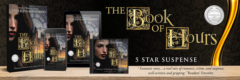
Well, it didn’t speak suspense to many other potential customers. And you know what they say, readers are convinced to open and buy books through the cover. So, I got in gear and changed the covers to my romantic suspense duology, The Coin and The Book of Hours, toute de suite, as the French say.
Fast forward to recently.
Remember my comment above about keeping an ear to the ground?
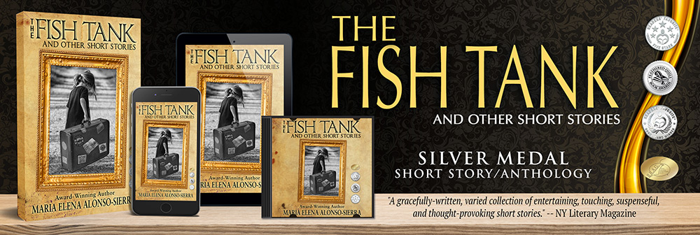
I love attending book signing events. That is where I personally get to meet my fans, draw readers into my world, and capture new customers. I get to speak to them about the novels at the same time they are browsing the books themselves. It was through several of these events that comments were said about my short story collection, The Fish Tank: And Other Short Stories. Several people were kind enough to say the cover of the collection was ‘creepy.’
Not intriguing.
Not pretty.
Just creepy.
And they only bought the stories because I had persuaded them the content of the book was worth disregarding the, ahem, creepy cover.
At first, I was scandalized. How could they think a sweet-looking child, holding a beautiful doll in an airport, creepy? Well, I hadn’t counted on a generation brought up by visuals from Dawn of the Dead, Chucky, It, or “The Walking Dead”. After a small, personal snit, I considered. This wasn’t only one person commenting on it, but several, and all came up with the same descriptor. So, after reflection, I considered this merited a constructive review of the cover and maybe a complete revision of it.
And that is what I did.
But how to choose a theme that would attract the readers’ eye, and suggest the content of the book? It is, after all, a collection of stories, all in different genres, and all with different thematic elements.
First, let me show you my original cover.

This image reflects the theme of the story of Cuban exile that the collection is named after: “The Fish Tank”. The story itself is about a little girl with her doll, waiting in an airport holding pen with her mother and other adults, hoping to leave Cuba in 1962.
So, my challenge was to make another cover that would say something about the stories themselves. So…what to use and do?
My first thought was to have my graphic designer come up with mini covers for each story and arrange those in the front flap. I thought that would be a brilliant idea—all stories visually represented on the cover itself. A journey to different times and different places, exploring different themes. My graphic designer, wonderful and patient man that he is, grunted and went to work. So, I searched for images, sent them, and he organized them into something, I hoped, would be amazing (he usually does, by the way).
But… how to organize it? Would it be just a jumble of randomized pictures, or would we place them as photographs on an album? Should they be colorized? Black and white? Matte or sepia-colored to reflect age?
After much consideration and discussions, we came up with these three templates.


The first one was very blah. The second one, as an album with pictures on the cover, looked promising. However, after much discussion, we chose the last stock image, the one with the London photographs. That gave enough blank space to place title of the short story collection, add award medals, and, of course my name.
The first result was this:

Then this:

Finally, this:

However, I still wasn’t satisfied. It was too crowded, the font didn’t say anything to me, and the font color was all wrong. What I DID notice, despite all the images on that cover, which very accurately reflected the subject of each story, was that my eyes kept going to the little girl with the suitcase. And, whammo! That was the answer. I consulted and brainwashed with my graphic designer, my sister, and other author friends, and they all agreed that what pulled the reader in was the little girl, struggling with a suitcase full of stories to tell. It showed stubbornness and perseverance, as well as the carrying of heavy burdens. All themes from my stories.
So, back to the drawing board (for my graphic designer) and the final product became this:

Et voilà, as the French say. Perfection. At least, I hope.
I won’t bother you with the constant back and forth and all the other failed attempts at creating this, nor the time spent on every little aspect, but I wanted to share a small snipet of what we Indie authors go through in the creation of a cover. This was but a taste.
I hope you enjoyed.